
Swatch Moonswatch - Mission to Pluto
- Derek Watanabe

- Apr 3, 2022
- 3 min read

It's no big surprise now that the Moonswatch is most likely the most hyped up watch for 2022. The recent collaboration made the news in more ways than one and you would probably have to be living on the moon as a collector to miss everything that went on with this release. I was able to get my hands on the Mission to Pluto which was loaned to me from my wife's cousin who waited nearly 12 hours in line at the San Francisco location on release day. I'm sure by now we know the big stir this has caused among Omega Enthusiasts and collectors with the reselling of this watch. I will give my views on that towards the end of the review. So rather write about the Collab and why this is what it is lets just dive into the watch so you can see the finish and quality and judge for yourself if this is worth $260.
My initial impression of the watch was very positive, although not my first choice in color it is a great looking watch. I think the design and colors used across the different versions are the major wow factor in the watch.

Diving right I did notice a lot of debris under the glass. While not in focus I did notice the "O" in Omega rather off and uneven.

The Speedmaster logo was probably the most even.

The Moon S Watch text seemed thicker in some places and thinner at others. Now it could be the style of font they used or it could just be badly applied. It is noticeable just by looking at the watch and the more I looked at the the sub dial print the more disappointed I got.

I did notice the paint around the subdials was quite bubbly in some areas.

The S etched into the glass was nice to see.

Checking out the sub-dials I wasn't all that impressed with the unevenness on the numbers. Now at first I thought this was how it was supposed to be but for me I think its just poorly done.

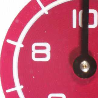


The minute track was a bit blotchy with some imperfection throughout the dial.


There were plenty holes in the application of the text around the bezel which wasn't all that surprising.


The pushers are easy to use and function nicely. The crown operation is smooth and easy to grip.


I didn't see any real big issues with caseback at all. The engravings are done nicely and it feels quite smooth and comfortable on the wrist.

The watch is very lightweight and for me I don't really mind the strap that comes with it. I think if you had much smaller wrist less than 7" it may be uncomfortable and maybe would want to swap it out for something else.

Now that we can see the finer details up-close we should ask ourselves should we justify paying over $260 for something of this quality? With this not being a limited edition and more eventually being made I think this watch selling for way over the listed price is just insane. I know people want it first and sometimes $1000 for some is easily $300 for others. I think those who think this will be Omega level quality in a watch for $260 is just fooling themselves. This watch has opened the flood gates to new watch owners wanting to get into the hobby which is always a good thing. For the MSRP price you are absolutely paying for a unique spin on a Speedmaster design in an affordable price. This does not mean that you get the quality or refinement that exists in an Omega. If you were to take the Omega text and branding off of the watch but kept the design would you still pay $260 or more for it? My guess is probably not. We want it because we like the colors and we like the fact that is says Omega on it.
Even though the watch may not be the most refined and has some QC issues, I still think if your interested in picking one of these up you should at $260. They have such a playful and unique design that its pretty hard to pass up. I hope everyone looking for one gets one and has patience in doing so. Good Luck!
.
.
Comments